# Metrics
Browse every OpenTelemetry metric Maple has received, then chart one with an aggregation, a filter, and a breakdown by attribute.
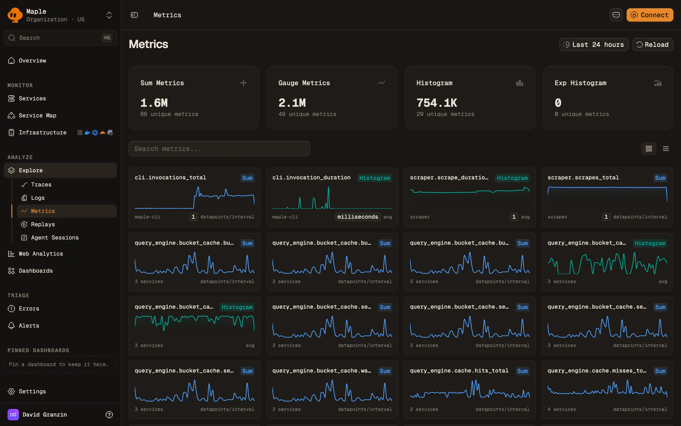
The **Metrics** page lists every metric Maple received in the selected time range, with its type, emitting service, and data point count. Open a metric to chart it: choose an aggregation, filter by attribute, break it down by a dimension, and add the chart to a dashboard or turn it into an alert.
## What data it needs
Metrics arrive over OTLP from an OpenTelemetry SDK or collector, or from a [Prometheus scrape target](/docs/integrations/prometheus). Maple stores four OTLP metric types:
| Type | Badge | Examples |
| --------------------- | ------------- | ----------------------------------------------- |
| Sum | **Sum** | Request counters, bytes sent. Monotonic or not. |
| Gauge | **Gauge** | Memory in use, queue depth. |
| Histogram | **Histogram** | Request duration with explicit buckets. |
| Exponential histogram | **Exp Hist** | Request duration with exponential buckets. |
OTLP Summary metrics are not stored. The Prometheus scraper converts summaries into sums and a quantile gauge before ingest.
The **Service** column and the service filter read the `service.name` resource attribute. Data point attributes become the dimensions you can filter and group by.
## Browse metrics
The default time range is the last 24 hours.
Four cards at the top count metrics by type: **Sum Metrics**, **Gauge Metrics**, **Histogram**, and **Exp Histogram**. Each shows its data point count and number of unique metrics. Click a card to filter the list to that type. Click it again to clear the filter.
The metric catalog in grid view. Click a type card to filter the list.
Type in **Search metrics...** to filter by metric name. Switch between **Grid view** (a sparkline card per metric, the default) and **Table view**. The table, headed **Available Metrics**, has these columns: **Metric Name** (with its description), **Type**, **Service**, **Points**, and **Last Seen**. Click **Load more** to page through long lists.
Click a metric to open it.
## Chart a metric
The metric page has a chart, a breakdown panel, and a side panel of metadata.
Query controls above the chart:
| Control | What it does |
| ------------- | --------------------------------------------------------------------------------------------------------------------------------------------------------------------- |
| **Aggregate** | How data points combine per time bucket. Monotonic sums offer `rate` (the default), `increase`, and `sum`. Other types offer `avg`, `sum`, `min`, `max`, and `count`. |
| **Where** | A filter on attributes, with autocomplete. For example `http.route = "/api/users"`. |
| **Group by** | **Everything (no breakdown)**, `service.name`, or any data point attribute as `attr.`. |
| **Every** | The bucket size in seconds. **Auto** picks one from the time range. |
The chart header shows the query, such as `rate(http.server.requests) by service.name`, and the metric's unit.
The **Top values** panel ranks values of one attribute. Choose it with **Break down by...** (default `service.name`). Click a bar to add that value to **Where**.
The side panel shows the type, unit, and whether a sum is monotonic. It also shows **Datapoints in range**, **First seen**, **Last seen**, how many services emit the metric, and each attribute key with its usage count.
## Save and share
- **Add to dashboard** adds the chart to an existing dashboard, or creates one with **Create & add**.
- **Create alert** opens a new [alert rule](/docs/alerting/alert-rules) with this query filled in.
- **Copy link** copies a URL that restores the aggregation, filter, grouping, and step.
## Query metrics from an assistant
The [MCP server](/docs/reference/mcp) exposes the same data:
- `list_metrics`: search metrics by name, service, or type, with unit, monotonicity, and volume.
- `query_data` with `source=metrics`: a time series or breakdown for one metric, with the same aggregations and grouping by service or attribute.
## Troubleshooting
- **"No metrics found".** No metric matched the search, type, or time range. Clear the search and widen the range.
- **"No data for this metric in the selected range".** The metric exists but had no data points in this window. Widen the range, or check that the emitting service is still running.
- **A summary metric is missing.** OTLP summaries are dropped at ingest. Export histograms instead.
- **"Not enough datapoints for a preview".** The metric has too few data points in range to draw a sparkline. Open the metric to see its values.
- **Rates look wrong.** `rate` and `increase` apply to monotonic cumulative sums. For a gauge, use `avg` or `max`.
## Next steps
- [Build dashboards](/docs/dashboards/build-dashboards): combine metric charts with trace and log queries.
- [Prometheus scraping](/docs/integrations/prometheus): pull metrics from exporters.
- [Uptime monitoring](/docs/alerting/uptime-monitoring): alert on HTTP check metrics from the OpenTelemetry Collector.
- [Services](/docs/explore/services): latency and error metrics derived from traces.